I’m tired of disaster porn

…Economic disaster porn, that is: articles full of gloomy statistics and jagged lines all trending downward. In their zeal to repudiate the irrational exuberance of the recent past, many writers seem focused exclusively (and obsessively) on bad news. It’s as if like jilted lovers, they seek to wallow in their grief.

The original of this graphic is said to have appeared in print with the caption “if the decline was fast, the recovery took a considerable time”. Apparently one is supposed to look at it, notice the similarity between the current downturn and the Great Depression, and say “hmmm, we’re in big trouble”.

Others have criticized the graph’s construction: the lack of a label on the y-axis, the arbitrary shifts in the scale of the x-axis. All of that is true, but there’s something even worse going on here. There is no theory behind the idea that “if the decline was fast, the recovery took a considerable time”. It’s just a graph someone put together and published because it looked scary. It’s disaster porn, pure and simple.

I’ve seen crap like this before. In the run-up to the big stock market boom, investment firms mailed out glossy brochures to convince investors that the good times were here to stay. “Sky’s the limit,” they all said. “Can you afford not to invest?” Back then the jagged lines were all trending upward. No way would they ever come back down, or so it seemed. But buried in amongst the hype, these brochures included at least one true statement — a disclaimer, probably put there to satisfy the lawyers: Past performance is not necessarily indicative of future results.

Does the fact that it took 22 years for the economy to come out of the Great Depression have any bearing at all on today’s situation? Who knows. There isn’t an economist alive who understands what’s going on in the current crisis, or who really knows what to do about it. But there’s one thing I’m certain of: by convincing people to ignore financial risks, pretty graphs and simplistic analyses played big a role in creating the mess we’re in. Why should we pay attention to them now?

Another blog for my feed

The about page for Data Evolution says the blog is “dedicated to exploring the disruptive changes underway in global data markets,” and their interests seem to overlap quite a bit with my own: statistics, data visualization, R, public policy, etc.

I particularly liked the post entitled What can Darwin’s finches tell us about the downturn. If you’re getting tired of the doom and gloom coming out of Washington these days, read this post. It’s one of the few things I’ve read lately that makes an attempt to look on the bright side of the current crisis.

Naturalists studying Darwin’s finches on the Galapagos Islands had found that during the wet season — when food was abundant — all birds were well-fed regardless of the length of their beak. But in 1977, an extended drought left only one in seven finches alive on the islands. Those that survived had longer beaks, which presumably gave them an advantage in finding food. “The birds were not simply magnified by the drought: they were reformed and revised. They were changed by their dead. Their beaks were carved by their losses.

The post concludes:

Downturns are not only good for innovation, they are necessary. While innovation may occur in times of plenty, crises allow the right innovations (hybrid cars) to outcompete the wrong ones (SUVs). This assumes that crises are allowed to run their course (the case against bailouts), but that there are at least some survivors (the case for them).

Data visualization blogs

One of my passions is data visualization. Given the graphical tools we have, and the availability of large data sets, it seems we are living in a golden age of data visualization. Here is a list of blogs I have found on the subject, in no particular order:

Information aesthetics
Information Design Watch
Flowing Data
Junk Charts
Visual Business Intelligence
PTS Blog
Charts by Jorge Camoes
Eagereyes.org

I didn’t realize there were so many until I put that list together. The other day I found a new one that is really interesting: Enrico Bertini’s Visuale.

If you know of any others, please let me know.

Gerrymandering

According to this post on Dymanic Diagrams’ Information Design Watch blog, computers have made it easier to develop gerrymandered congressional districts. The district they used to illustrate the post was so laughable I had to look it up. And yes, it really does look like that:
4thdistrict
I find it particularly funny because I grew up in the southern earmuff of the district. Anyone familiar with the Chicago area knows exactly why it has such a crazy shape. Read Wikipedia’s article on gerrymandering (it uses the Illinois 4th as an example) for a good explanation.

I like how it runs right down the middle of Roosevelt Road, turns up Harlem for a stretch, then wanders right into the middle of the Eisenhower Expressway — like a drunk trying to find his way home.

Information Design Watch goes on to say:

Mathematicians and lawyers are focused on improving the reapportioning process coming up in less than two years. Another use of their analysis is simpler – to find the worst offenders and shame the politicians that put them in place.

Good luck with that. With one or two exceptions (Hi, Steve!), Illinois politicians have no shame.

It’s cold outside

The cold weather this week made me wonder how rare such cold snaps are around here. I found daily high and low temperatures going back to 1910 — nearly 100 years of data. Yesterday’s low was 5 ºF. During the past hundred years, the daily low has been 5ºF or below on 91 occasions. So it happens slightly less often than once a year. That’s not too bad.

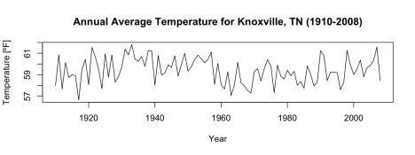
The figure below shows the average annual temperature from 1910 through 2007. Notice any trends? I don’t. Linear regression says slope of average temperature vs. year is negative (-0.004734), but not statistically significant (p=0.264).

Average annual temperature for Knoxville TN, 1910-2008

Average annual temperature for Knoxville TN, 1910-2008